Credits
EP – City on a Hill
Producer / Designer – Dom Macaluso
Producer / Sound designer – Zac Hodgkinson
Director / Story – Dana Newell
Animator – James Johnson
Inspired by Revelations 19

Dana Newell helped City on a Hill create the sermon trailer for their Revelations chapter.
Being the darkest book of the bible with powerful imagery, Dana jumped at the chance to write something foreboding.
The book of Revelations reads in a linear fashion with a narrative about the final war between good and evil, heaven and hell … the end of the world.
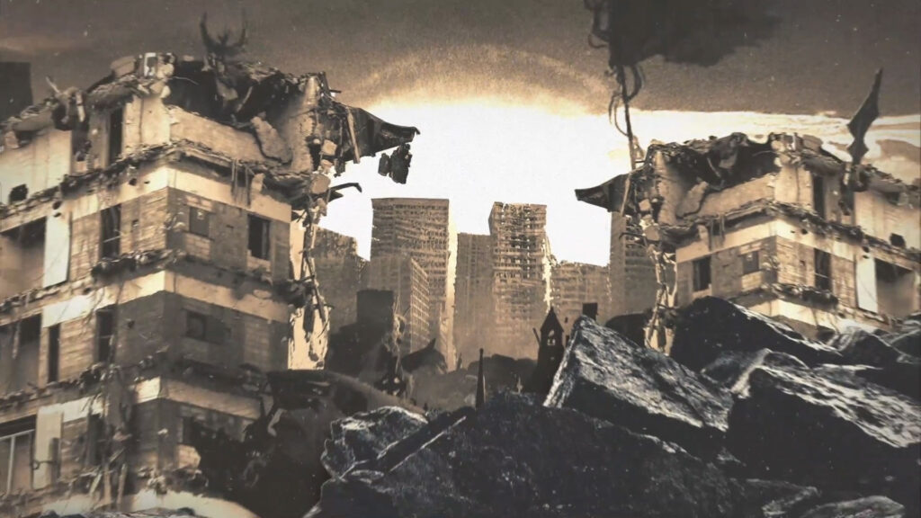
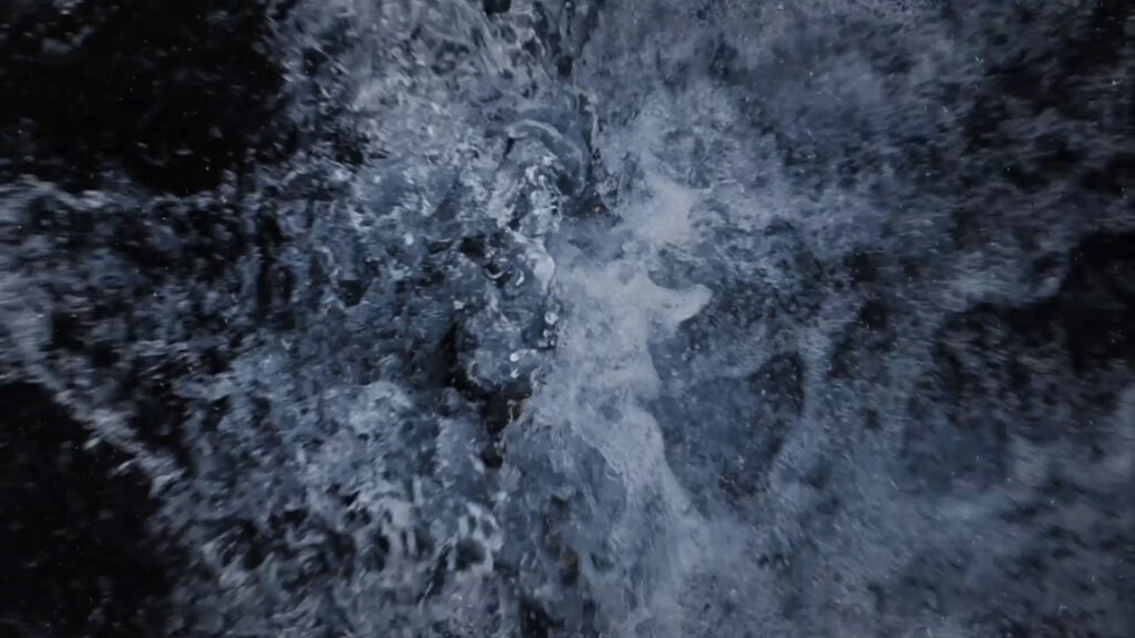
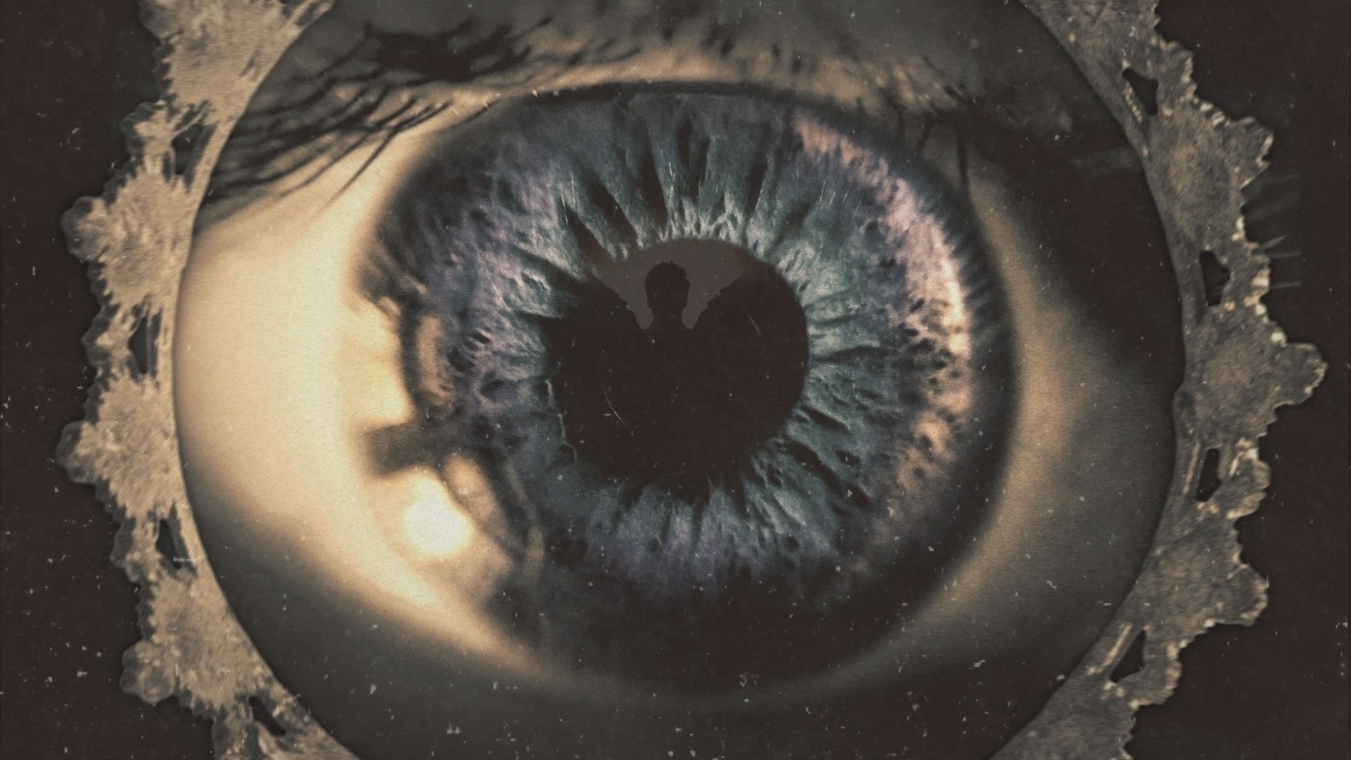
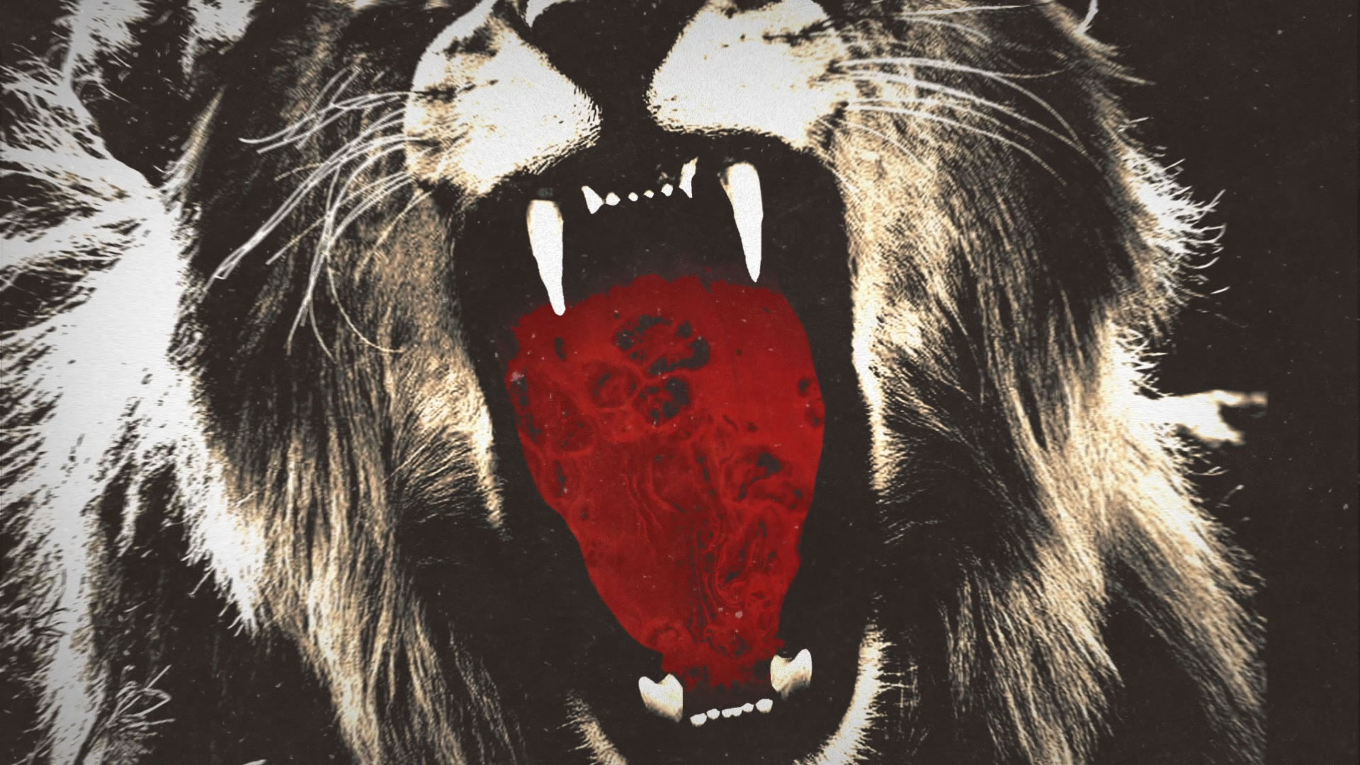
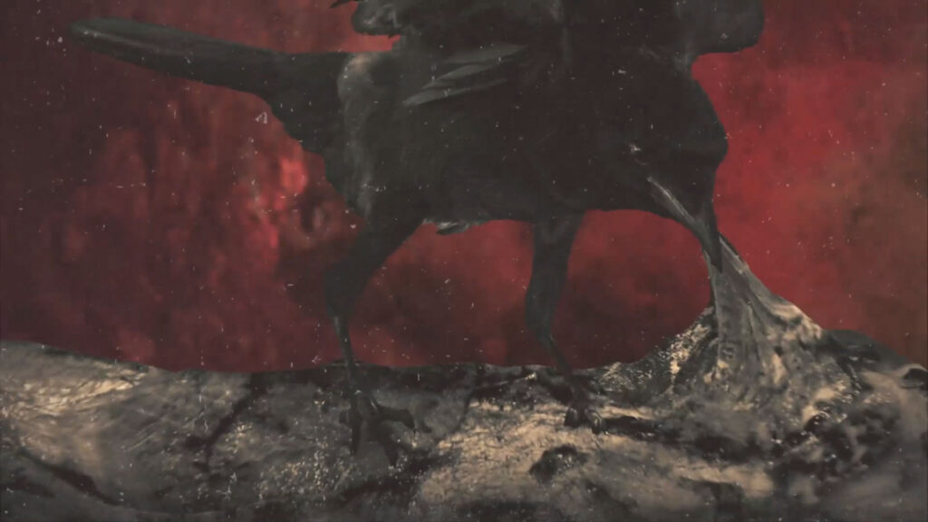
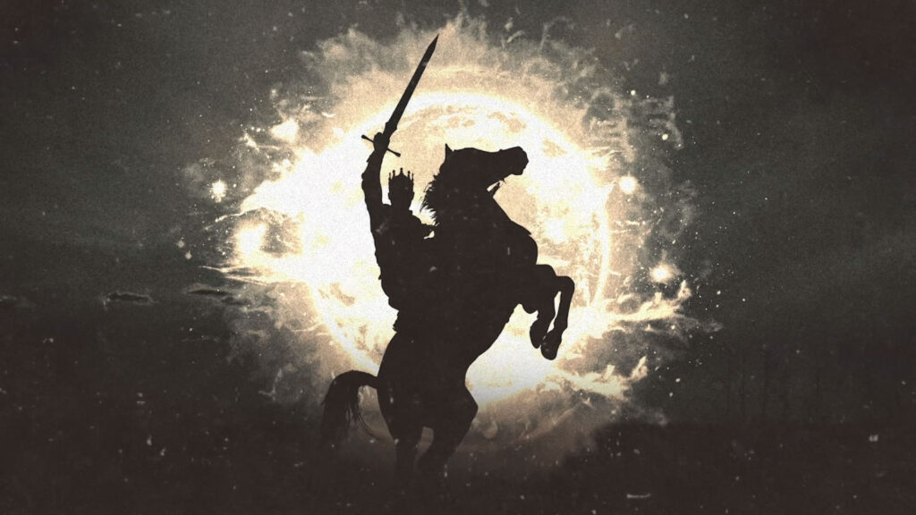
Rather than create a 40 second narrative that spoils the ending, we captured the images that appear in the book, like the lava river, eyes shooting fire, the birds eating flesh and of course, the Horse and Rider, and worked them in together with seamless transitions as a montage of imagery. So this way, we give nothing away, but leave the viewer intrigued.

When translating a book which is still highly controversial and uniquely discussed across the modern church, we both had flexibility and restrictions with our scene design and layout. When any reader sees a film after reading the book, there is a sense of majesty that has been taken away. Nothing is as ever good as ‘the book’ or … our own unrestricted imaginations. So when writing the script for the trailer, with so many Executive Producers on board, there was a bit of tooing and froing about what ‘does this actually look like’?
With a short time frame from initial pitch to release in cinemas across Australia on the 26th of Jan, we were also limited in what we could achieve movement wise.
I think the parallax motion of the 2D images works well to capture the snap shot of the book whilst still creating that excitement of what’s to come.
The music and sound design played a big role creating the epic-ness of the brief. The drums, as if a medieval war is about to commence, along with the out-of-this-world sounds echo.
The trailer plays in Hoyts Cinema at City on Hill across 7 locations.

Inspiration
Our inspiration for the creative for this aniamtion was the opening titles for AMC’s series THE WALKING DEAD. I loved the grungy design of the post apocalyptic world and beautiful artistry of the composition in design, motion and music.
However, we didn’t have the luxuary of a long production pipeline and access to live action characters playing out the actions on a green screen stage like Huge Designs did. However we made do with the wonderful talent we had and the still images we were able to cut, grade and move in that parallax fashion.

The Process
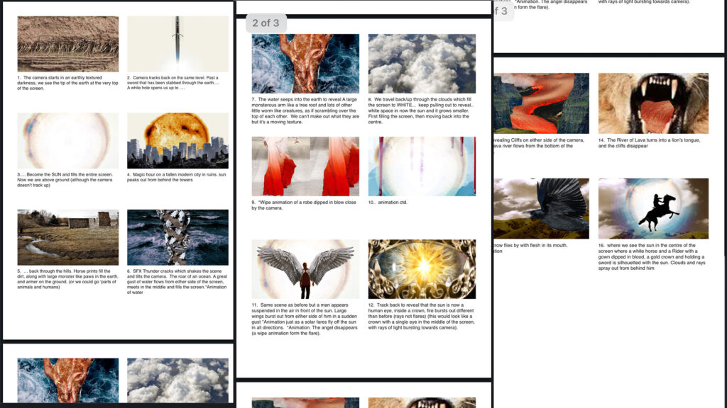
Here’s some early images we used to help create the visual narrative between the departments before we started the design phase. When constructing a very visual piece, there is a lot that gets losts in translation when discribing scenes, so it’s helpful to draw it out quickly before we invest too much time in design. These images below were not used as design references, but rather scene construction images to help the script writer communicate with the designer and vice versa.
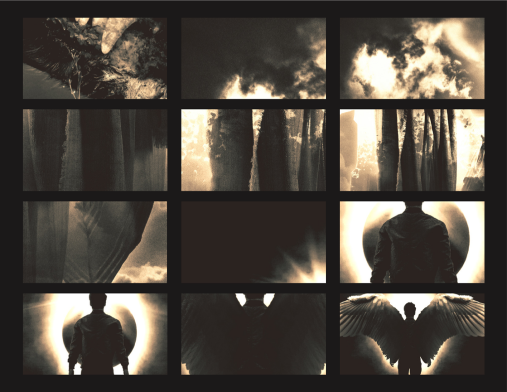
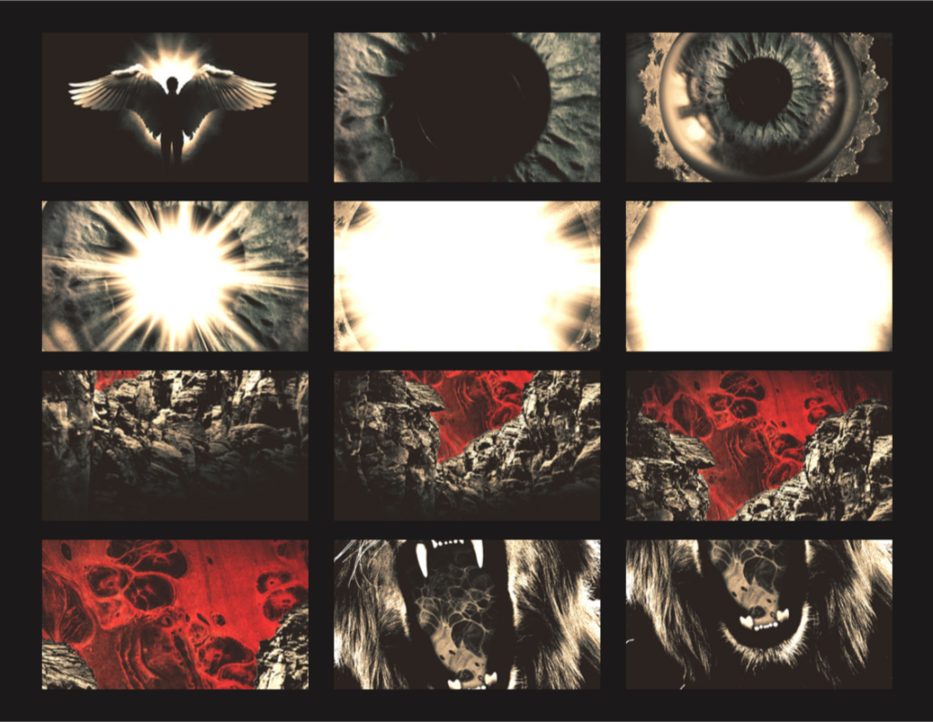
The Storyboard phase
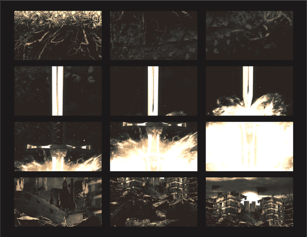
These beautiful storyboard designs by Dom below are what we shared with the animator so he knew what frame came where. It’s also helpful for myself as the Director, to give feedback on scene transitions, final design amends and to review the bigger picture of the narrative. This is where we essentially do two things, we create the assets and build the scenes, splitting up the layers, and pop them in a storyboard so we can see how it will look in sequence. This comes after the script is signed off and the camera movements are discussed.
Next, the animator will put together an animatic, which a crude animation of the designs. This helps us experiment with timing of the movement and play with music and sound design.
Once we are happy with the big picture movement we start to work on the finer details of the piece with what whatever time we have left.
The end result is a 40 second parallax animation piece constructed from still images. It is mature in design and visually intriguing without giving anything away. This shouldn’t be viewed as a whole complete story, but rather a sneak peak of the sermon series that will follow over the weeks to come.